Tag Archives: challenge

WIP Beaded Journal Project

jan 2010 WIP Beaded Journal Project

The Beaded Journal Project has begun again. The third round of this amazing project begins with January 2010 and will end in December. The goal is to make a beaded work of art that is a visual journal representing that month. You can read more about the project at the website. This year there are hundreds of people participating. I am part of blog #3 along with 100 others.

So this is my January page in progress. Last year, I did alter style pages that were big (8″x 10″) and an odd size, which is making it difficult to finish them off in a professional looking manner. But it will be done, eventually! Meanwhile I move on. This year I thought about a doll shape either flat or 3-D. But I decided that would be pushing it again. Last year was really my first exposure to beading and it was a wonderful challenge. I decided on a small (4″x6″) size and a basic postcard shape. I learned quite a few things from Robin in her class, so these are not multiple layers with batting (like last year’s, which added to the complication of finishing.) Instead just a simple piece of paper backs the fabric.

I chose “Journey” for my guiding word for 2010, so these pages will hopefully be in tune with that word as well. But I have also been very interested in the tree as a symbol lately. I like the idea of growth, the protection of bark, the stability of roots, and even the element of annual life, death, hibernation and rebirth. This month’s page represents that symbol.

I still have quite a bit that I want to do on this page, but it is moving along smoothly.


2008-2009 Beaded Journal Project Update

All 12 pages from last year’s Beaded Journal Project are started, 9 of them are completely done with the beading. However, I am still struggling with how to display them or back them/finish them. At first I was planning to make them a big book together, then as little shrines with equally beaded doors that closed. I tried a number of different ways to make the pages sturdy enough to stand on their own, but flexible enough to open and close. I tried thick interfacing, felt and quilt batting of different thicknesses, these were great for opening and closing the doors, but didn’t work at all for standing. Then I tried some card stock, cardboard and finally mat board. These were either too thin or too thick.  I thought I had it all figured out after Robin’s class, but I can’t seem to make it work with the odd shape. Besides, where am I ever doing to display them where I have 12 podiums that are high enough to be able to examine the details.

9 months of BJP

My next plan is to try and turn them into a wall hanging, still keeping them in the groups of three that were part of the original plan. But because I have already turned the edges and backed some of them I am not sure how I will attach them. I am thinking perhaps reverse applique. I auditioned some groupings and some backing fabrics. It seems that a simple black will be the best choice, other colors will detract from the work.

This is June’s page, quite a difference from the beginning. June is the end of the school year so it is very hectic, closing up the classroom and getting ready for the summer. I created this fabric from a doodle I did in my paper art journal at my April art retreat. I scanned in the doodle, then mirrored it in photo shop, then printed it out on fabric. I used a lot of new techniques I learned from some beading books that I acquired, and then adapted to my own style.

dec2009 062

Here are the remaining ones that need to be beaded.

This one is July. Spending time in my garden is the main thing that I enjoy during the summer months. This one is still very raw and has no bead work yet. But it is still part of the plan.

dec2009 052

This one is August. I have been training for a triathlon all summer and August is the heaviest training month. Still need to get beading on this.

dec2009 054

I am really pleased with how the beading parts are progressing (although slowly) and I am getting really excited for the next round.

Here are some things I learned from the first round, the reading and research on beading that I have done in the process and my class with Robin.

  • 8″x10″ is WAY too big for a first beading project!!! Prior to this project I have mostly been making fabric collages from 22″x 18″ or larger. I have also made little ATC sized mini fabric collages. But these have all only had a little bit of bead embellishment. So I thought that this ‘small’ size was going to be fine. BUT for bead embellishment it was too big. ~so for my next BJP I will be creating in a smaller size~
  • Alter-shaped is way too advanced and difficult of a shape. Again for my first project. The pointy shape is hard to turn and finish. yikes!  ~so for my next BJP I will try to pick an easier shape, however I am really leaning towards dolls~
  • Quilting and including batting layers are not necessary. In the class with Robin we just used paper as a backing . This made it easier to turn the edges when the beading was done. The thick layers made this part very difficult in this first series.
  • Printed fabrics with pictorial images will limit the beading. Because I was new to the whole thing I used some printed images to guide my beading, almost like a coloring book I beaded the images. This was fun and was a good way to start, but it is also very freeing to move to non-representational fabrics.
  • An Ott light is a GREAT advantage.
  • A bugle bead pathway is a great way to move forward when you are stuck.

So a few days from now is the NEW year and a new round of the Beaded Journal Project. Will I pick a smaller size, an easier shape, neutral farbics? I am really leaning towards dolls!

TopFlight Websites: Checking in on The Pulse

More great news from The Pulse (This collaborative project aims to introduce you to new artists, help you get to know familiar faces even more, and allow you access into the creative hearts and minds of a very talented crew of individuals.) 

 NYC2007_2 133

Today’s question: At least for today, your can’t-live-without blog or website is…

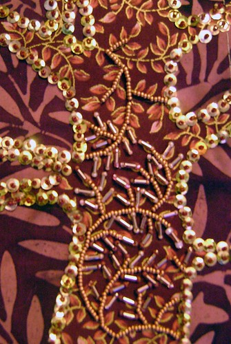
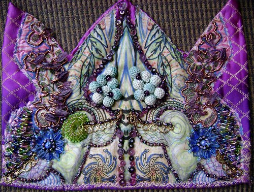
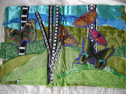
It seems like so many artists have difficulty picking just one website. Although, so many artists pick Flickr as a daily top pick, must-see, website. Always the perfect site for the eye candy junkie. And though it will take hours of webtime, I am determined to check out all the suggestions in this four day long quest for the best websites. Needing some new eye candy in your life? Then check this out!

Marilyn Gallas loves to visit Kelly Rae. As soon as I clicked the link, I realized that I have stumbled across Kelly Rae before. I have seen her book cover, seen photos of pictures of people taking classes from her or being inspired by her work. Her backgrounds are a rich tapestry of luscious color and texture (my two favorite elements of art.) Why she wasn’t already in my google reader is a mystery that was quickly fixed. Then when I went to go add her to my flickr favorites, I saw she was already there! No wonder her art was wonderfully familiar. Now where can I order that book…

Michelle Ward is an artist I have followed on and off but didn’t know she had numerous blogs these days, including one that has some great challenges and tutorials.

Stephanie Hilvitz (BTW…who’s aprons and tablecloths are flirty and wonderfully colorful!) is inspired by Elizabeth’s site Be…Dream…Play… I can see why Stephanie likes to visit Elizabeth’s site. It is filled with a color and vibrancy of life that is infectious.

When I followed Canadian Artist Kate Strickland’s favorite link to an Austrailian based blog by printmaker Jo Horswill, only to I find my friend Bridgette (who just moved from my neck of the woods in Seattle, back to her home in Chicago) It made me realize first how easy it is to get lost in a string of links AND how small and strange the internet world can be.

After looking at a growing list of art websites that are filled with colorful photographs, smiling kids and artists, along with proud displays of creativity, I just had to chuckle to see that James Michael Starr’s favorite site is http://weather.com.

On the whole, I am more visual than verbal. But I was very intrigued to see that Shona Cole’s pick was a Poetry site that hosts podcasts of and about poetry. As a teacher, this is a site I will have to find a use for with my students. I will also have to return to Shona’s sites. I am so impressed with her publication resume.

It is also interesting how many artists listed their own blog or site as a go-to link. I do check on my blog regularly, sadly mostly to delete spam comments, but I wouldn’t have thought to list it as an answer to this question. I am curious as to why they did list it. It makes me think that I put some extra meaning into the question. But with over 80 participants in the survey, the questions are bound to be interpreted in many different ways.

If you haven’t made it over to the Altered Page to check the Pulse… I highly recommend it, as this month it is MY daily go-to site.

Jesus Christ Pose

Jesus Christ Pose, originally uploaded by Charger’s Mommy.

Media:  fabric collage
Dimensions:
  22″x22″
Date of Work:
  07/2008

This is created for the EBSQ Annual Ripped Show 2008. I have been doing a lot of mandala-like art recently, so I was drawn to Tina’s “Dali and the Eye of God” piece. I translated it into fabric applique. It is quilted and embellished with lace, ribbon and a variety of fabrics including silk, cotton, and rayon. I named it after a soundgarden song that kept going though my head whenever I would work on it. Starting August 1st you can vote for your favorites at EBSQ. 

christlikeposeWIP
Here is a little Work in Progress Step-by-step snapshot. I still need to finish a bit of quilting and make the hanging tabs…but my machine decided to go AWOL on me, so I will be running it into the shop tomorrow.

This piece did double challenge duty. In addition to being for the EBSQ ripped show it is one of my 5 mandalas for Jen’s July Challenge. This one will be for the Aether/void/spirit/heavens catagory, since it is spirtual in nature.

Experiment #4-B Reverse Applique’

Experiment #4-B Reverse Applique

I have done a lot of ‘reverse applique’ in the past 4 years, so this is not a new technique. The book shows a different way to do it than I have been doing in my work. I really should have tried their suggested method. I layer a bunch of fabrics, sew my design and then cut away the top layers that I don’t want and allow the lower layers to show. In this piece the top most fabric is the bright print, with yellows below it and then green below that. The green is actually under the batting. I like the additional depth that this allows. The book shows cutting the holes in the top fabric first, then sewing on the behind fabrics.

I actually really like this one… again all scraps and talk about bright! So many of these fabrics are from a bag of stuff I got from my mom, that she got from storage that was originally from my GREAT Aunt Minnie. So they are from the 40’s-70’s I imagine.

So far, I am having a great time with this challenge and the resulting fabric journal is going to be very cool!

Experiment #4-A Raw Edge Applique’

Experiment #4 Raw Edge Applique

There are several Applique techniques in my challenge book “Exploring Textile Arts“ This is called Raw-Edge because the parts that are appliqued are not finished on the edges in any way. To do this, I used iron on facing to hold down the purple and green applique shapes, then caught the edges on the main piece with a decorative stitch. I did this before adding the batting and doing the quilting. So the additional quilting areas allow the swirl and points to puff up above the rest of the piece.

This happens to be an image I tend to doodle all the time (mostly when sitting through boring meetings) so I picked it for this series of experiments. I plan to do the other 5 types with this same design.. maybe even the same color combos if I can find the right scraps. This fits my 8×10″ book plans. This is very similar to the type of applique I usually do in my collages, but I usually finish the edges with a satin stitch.

Experiment #3 Pleats


Experiment #3 Pleats

Pages 74- 77 go over the methods of pleating using a “perfect pleater” (Another project from my challenge bookExploring Textile Arts“) I looked around a bit for said “perfect pleater” and they are a bit hard to find and more money than I wanted to spend for some experimenting. So I decided to try doing pleats the old fashioned way… just folding and ironing! I think the pleater would have helped hold the ironing together in the transition from ironing board to sewing machine. The book shows ironing on some facing to the pleated piece and then removing it from the pleater in a now stabilized single piece that won’t unfold on you.

The arsty framed examples of pleating in the book used some decorative stitching to have the pleats fan in different directions. So I gave that a little try. Again I used scrap fabric (some old vintage stuff that I am QUITE sure was from a dress my grandmother wore.)  I am thinking I would like to use this technique for grass areas in an upcoming piece or even a picket fence. It does have a nice texture and dimension to add to a piece.  

While it is nothing to scream about artisitically… it is just one small puzzle piece that will be put to use with many other new techniques. So far they have all been fairly quick and easy little techniques. But new things for me to give a try, which I think is the whole purpose of the challenge…

Experiment #2 Fabric Weaving


Experiment #2 fabric weaving

These colors and prints are pretty garish, and the piece almost hurts my eyes to look at. BUT, in my defense these are SCRAPS that I am using to test out the idea… not necessarily a planned finished product. I think that this method is what was actually what I was supposed to be doing when I came up with this:

WIP_FAJpeaceprayers01

I saw this quilt and wanted to duplicate it, but I misunderstood her directions (or rather I didn’t see them until I had made up my own idea of how she did it.) I am still very pleased with how this blue and white “Peace Prayers” came out. On this one I cut 2 pieces of fabric the same size and put iron-on interfacing backing on them. Then I layed them on top of each other and used my rotary cutter to cut them into even curvy strips. I think this is where I took a different turn (ha!) I layed them all even again and now cut horizontal where I had cut vertial curvey lines. Now I had a bunch of little puzzle pieces essentially. I ironed them down to a 3rd piece of fabric, as the backing. This method gives me a whole second set of puzzle pieces to create a mirrored version of the same thing. Because of my desired meaning for the piece I wanted the red to show through. After the pieces were ironed down then I applique stitched down all the edges. As for the meaning…. this is about war… the red represents the rivers of blood shed, the blue symbolizes hope for ending the war and finally the white is for peace. I created this for a fabric journal swap back in April 2007.

So here I am finally trying the “correct” way to fabric weave. Another project from my challenge bookExploring Textile Arts” It is actually both easy and hard. An easy concept, hard to get everything to line up just right, hard to decide on what fabrics might work best, easy to sew once all put together.

I had planned to keep all my experiments in an 8×10 format, but this didn’t really work out that small. Perhaps it will become the cover for the book. or a crazy placemat, it is just the right size for that… I’d just have to make some matching ones! RED is supposed to induce appetite. Wait… I’m trying to lose weight so scrap that idea!

Experiment #1 Bobbin Sewing

Experiment #1 Bobbin Sewing

This is the first of many experiments from “Exploring Textile Arts” that I am working on for the month of June 2008 for Jen’s Challenge. It uses Decorative Bobbin Sewing. (pg 88) The point behind this style of sewing is to use thicker fancy and metallic threads that ordinarily wouldn’t go through the eye of a needle. You put the fancy thread on the bobbin and sew from the bottom. I don’t actually have any of these fancy threads and I am really in a USE WHAT YOU HAVE frame of mind, since I HAVE so much. But I do want to have quilted text in my new series of work so I need to practice and experiment with the best ways of sewing in words.

The text that is sewn several times is “Digging in the dark earth” and will be part of my just starting Journey Series, this one about gardening. I printed several cursive style fonts in different sizes on paper in REVERSE, then layered that paper on the top, a felt center, with the printed fabric on bottom. I then free-motion stitched this fabric sandwich using the bobbin method.

The GREEN thread words are the ones in this fashion. WOW! it is very, very hard to sew backwards cursive! I still need a LOT of practice in free motion anyway, but trying to write script is pretty hard.

The BLUE thread is when I gave up on the bobbin backwards style and flipped my fabric to the top. For one of these trials I wrote free-hand with a pen and then sewed over it. You can see the shadow of the ink, so if I end up with this method I will need to BUY some washout fabric pens or pencils… which I really need anyways to do some of the other quilting things I have planned. 

My final trial on this piece, I just sewed the words completely free-hand.(they go crooked at the end.) This has some possibilities, but I am most leaning towards the write with a washable pen and sew over that.

I ALSO have letters that my sewing machine can do for me, so that was my next trial. (But it doesn’t really fit with the experiments in the book, just something I need to try for this series.) Finally, I wrapped up with a few practice free-motion flowers.

So that is today’s experiment. I believe I will keep with about an 8×10 size for these experiments and put them together in a fabric journal with a printed copy of my blog notes on the process.

One more practice with more words. This time using the pen method I think I like best. Now to get some washable pens. But I still feel like it is WAY Messier than I want for the piece. Ultimately it will be blue thread on blue fabric and the sky behind a figure. The idea is for it to be background that you would need to work at to read, but that does NOT detract from the other parts of the piece. (Can you read it?)